Abstract
PT has been generally accepted as a green replacement for driving in many cities worldwide. While average GHG emissions for buses are much less than for driving, its distribution shows that some bus routes emit more GHG than cars. Exploring the spatial distribution of bus emissions is important because it can justify alternative PT, such as on-demand services. On-demand services are known to cost more, but lower emission outcomes can justify the extra cost. This study explores the spatial and temporal distribution of GHG emissions in Auckland and presents CO2 emissions per passenger kilometres as a KPI to evaluate the performance of bus routes. The results show that 14% of the bus routes in Auckland emit more than driving. This contradicts the general belief that PT is always a green solution. High-emission PT routes are good candidates to be replaced by low-emission on-demand services. These results can also help transport planners factor in GHG emission costs when planning PT routes.
Introduction
Public transport (PT) systems happen in space; therefore, their costs and benefits cannot be equally shared among their users. The key performance indicators (KPIs) measuring the performance of the PT system tend to use the average outcome of the system, which in the case of greenhouse gas (GHG) emissions, shows public transport (PT) greener than driving. However, the spatial distribution of the GHG shows some bus routes emit higher GHG than cars.
In Auckland, for example, Transport Emissions Reduction Pathway (TERP) targets 70% electrification of the bus fleet by 2030. However, it doesn’t provide any guidance on how to minimise the emissions for the remaining diesel buses. Even if 70% electrification is achieved, it is estimated that diesel buses will cover more than 40 million VKT in 2030, which translates to 91000 tonnes of CO2. Mapping the CO2 emission can help PT planners identify high-emission routes and build a case to replace them with low-emission alternatives such as on-demand bus services. A mere 8% reduction by optimising PT routes can save 7280 tonnes of CO2 annually.
This study aims to develop a simple tool to measure the distribution of PT emissions. The primary objective is to add a spatial dimension to the existing understanding of PT emissions. This tool can calculate CO2 emission per passenger kilometre as a KPI to benchmark PT performance.
The next section of this study is a summary of the methodology. It is followed by the results and a discussion of the findings. The study concludes with the importance of the spatial view of GHG emissions and their potential applications.
Method
Case study of Auckland
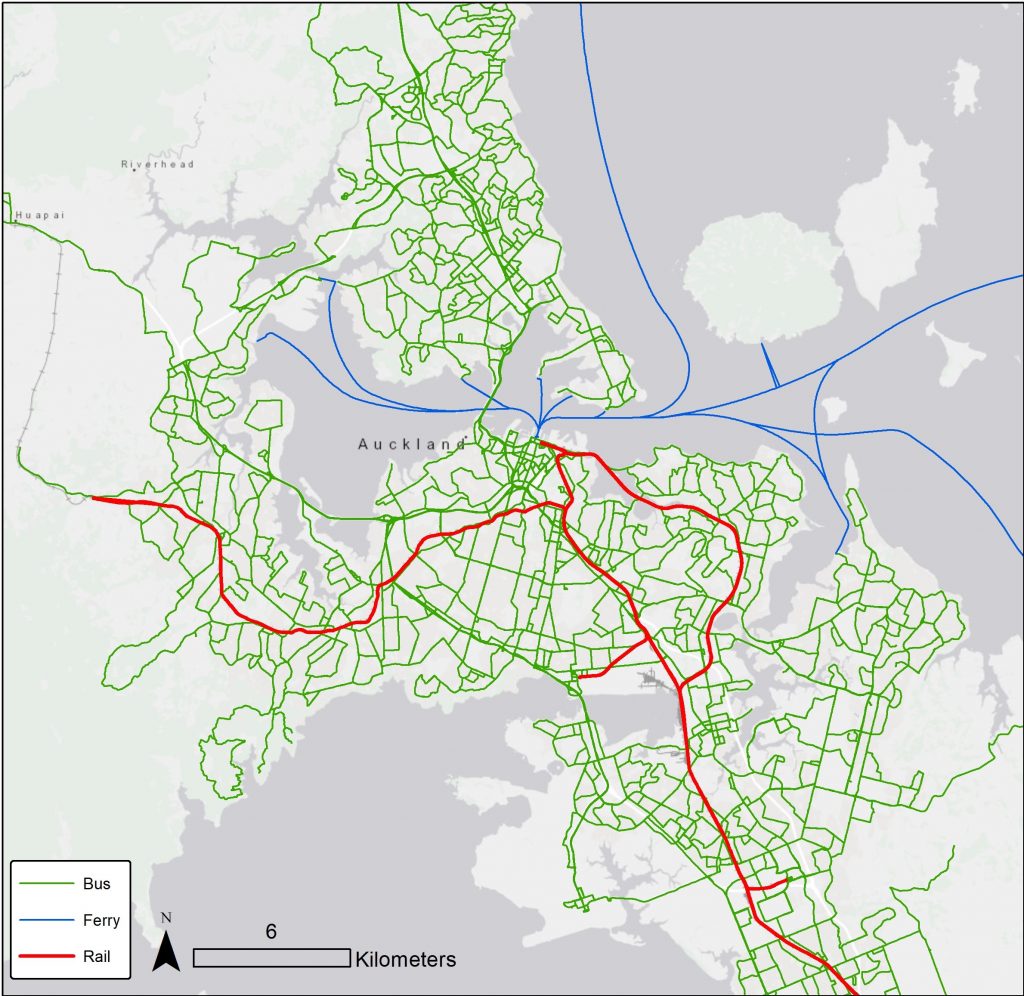
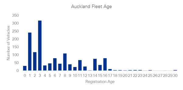
Auckland is competing internationally to attract investments, skilled people, and businesses. An efficient PT system can increase the competitiveness of Auckland. The Auckland region is home to 1.6 million people and provides 921,182 job opportunities. On a Thursday in 2019 (the case study date), its 780 bus fleet provided 213,443 service kilometres and 9,460 service hours, moving 224,013 people for 3,032,247 kilometres on the PT network. Figure 1 shows the PT system in Auckland, and Figure 2 shows the age distribution of its bus fleet.
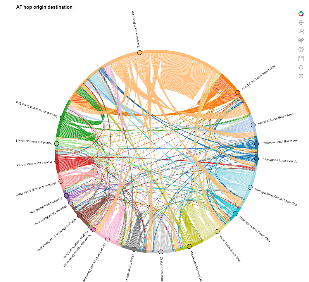
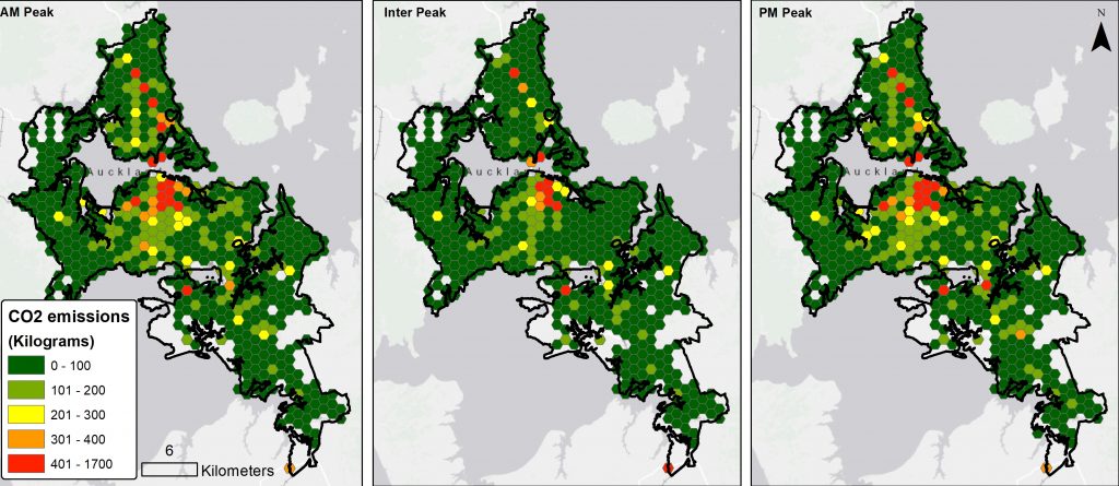
AT hop data collects information on people using PT services. It can measure the patronate of each PT trip between any two stops. This data can be aggregated by trip, route, time, and geography. Figure 3 shows the bus travel between any two local boards in Auckland based on AT Hop data.
Figure 3: AT hop origin-destination based on local boards (click to see the interactive version)
Modelling GHG emissions
Auckland’s PT system is responsible for 3% of the total transport emissions and produces about 136,000 tonnes of CO2 annually. The development of new open data and methods to estimate vehicle emissions has become particularly relevant amid the debates on urban health climate change and vehicle technology.
The model in this study leverages public transport data in the General Transit Feed Specification (GTFS) format. This open data standard is widely adopted by transport agencies worldwide, making the method easily applicable to different contexts.
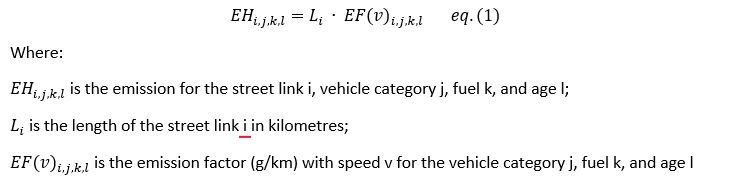
This model uses equation 1 to estimate the pollutants emitted by each public transport vehicle at each road segment and time of the day. To do so, it combines the space-time positions and speeds generated by the transport model with some fleet characteristics provided by the user and emission factors data.
Measuring the GHG per passenger Km
The AT hop data records each PT trip’s origin and destination stop. This study uses GTFS data to model the PT network and measure the distance travelled between any pair of origin and destination stops. The model will add the distance travelled and the PT route taken for each Hop record. The results can be aggregated at the route level to show the total passenger kilometres travelled on each route.
The outcome of the emission model can be aggregated at the PT route level to show the total emissions for each route. If this value is divided by the total passenger kilometres travelled on each route, the result can be used as a KPI to benchmark the efficiency of each PT route in GHG emissions (equation 2).
Results
This study creates two models for Auckland’s public transport from GTFS data. First, the emission model estimates the pollutants emitted by each public transport vehicle at each road segment and time of the day. Second, the PT model maps AT hop data on GTFS data to show the distance travelled and the route taken by each PT traveller. The output of both models is aggregated at the route level. The emission per passenger kilometres for each route is simply dividing the aggregate outcome of the first model by the second model.
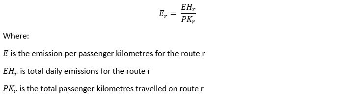
The findings estimate 324 tonnes of CO2 emissions by Auckland’s bus feel. Figure 4 shows the spatial distribution of the estimated CO2 emissions for AM, PM, and Inter peaks. As expected, there are more emissions where there are more PT.
The interesting outcome is where we sort the routes based on their GHG per Passenger KM. From 953 bus routes active on the case study date (this includes school buses), 163 (17%) routes have no patronage. It is also possible that AT didn’t record travels on these routes. 6 (1%) routes emit unexpectedly high CO2 per passenger km (more than 3000 grams), which needs more scrutiny. 132 (14%) routes emit more than 250 grams per passenger km which is higher than an average car. While drivers are not expected to follow bus routes, this benchmark shows where PT emissions are too high. This can focus transport planners’ attention on areas that can be improved from a GHG emissions perspective. The emission per passenger km for all bus routes is shown in Figure 5.
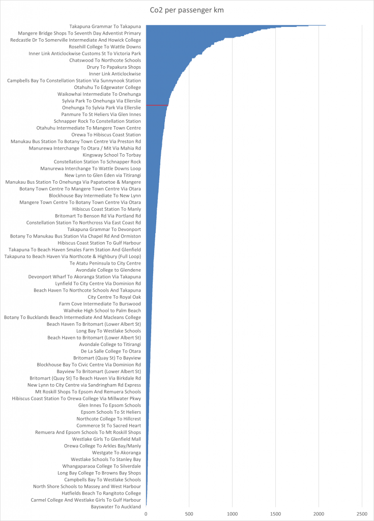
Figure 6 shows the spatial distribution of the routes that emit more CO2 per passenger km than a light passenger car.
Conclusion
This study introduced a KPI to measure PT emissions per-passenger km. By leveraging GTFS data, the proposed model can be used in different contexts with few data requirements. The model has been done in R and Python, making it easily scalable and applicable to estimate the emissions of various pollutants from single routes to entire public transport systems at high spatial and temporal resolutions.
While the average CO2 emission in Auckland is 106 grams per passenger km, less than half of driving, the absolute PT emissions vary across time and space. Finding where emissions are much higher than average is essential, so transport planners can focus on improving those areas.
It is important to note the caveats of this study. I used only 2019 data which is outdated. The model can pull in the most up-to-date data to generate more usable outcomes. I used 2019 as the case study date to use the readily available data instead of waiting to collect more recent data.
This study can be used to lower PT carbon emissions and build a case for electrification, on-demand PT services or flexible PT routes. For example, if a route is emitting high CO2 per passenger km, then the savings in CO2 emissions can justify the extra driver cost of having a smaller or on-demand vehicle. It can also be used for benchmarking and comparing cities. Future research can also target social justice issues in PT where people are more exposed to PT emissions.